
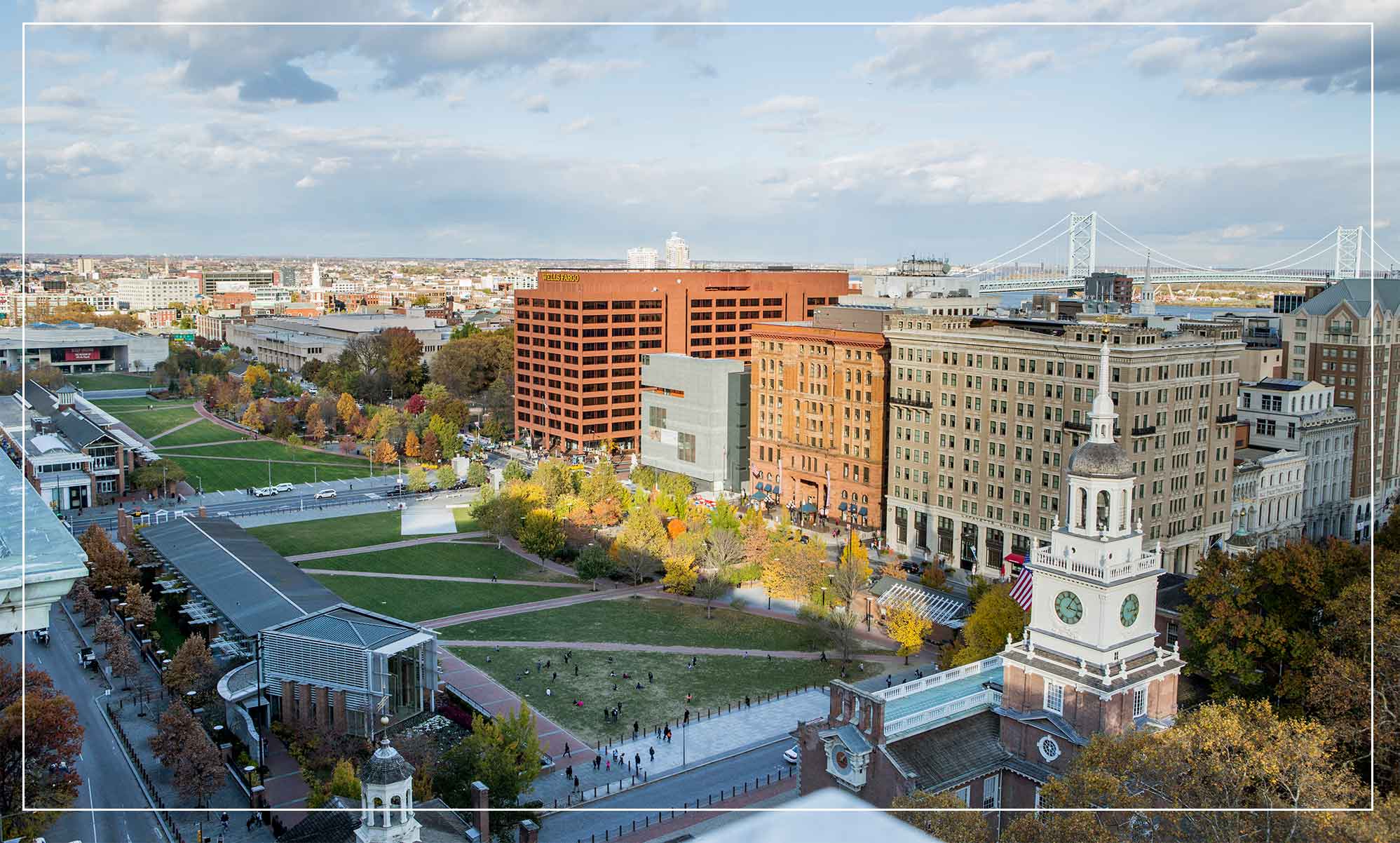
From Past to Prime
For over 50 years, The Curtis occupied a central role in American cultural life. In 1910, it was where one man, Cyrus Curtis, pictured the future of his fledgling publishing company. And as he constructed this impressive headquarters, it was where he built a legacy from the ground up.
With beloved publications like The Saturday Evening Post, The Country Gentleman and the Ladies Home Journal, the American magazine industry and popular culture found their voice within these walls. The design and construction of the breathtaking Tiffany mosaic mural made a name for the building in the art world as well. And while Curtis Publishing has now faded into the background of the grand Beaux-Arts architecture, the pieces are still there for a space that makes people take notice.
New Travels Fast
Soon, residential tenants can take a yoga class downstairs before watching the sun set over the park from their private terrace. Business execs can close a deal from a historic corner office and celebrate with drinks alongside Washington Square at PJ Clarkes.
And tourists, locals and residents alike can people-watch over coffee and relax after a successful shopping trip. There’s a new way to live and work in the city, and it’s all about to happen right here.


Defining Features
- The 6th Street entrance opens to the impressive 750-square-foot “Dream Garden” mural. Commissioned in 1916 by Louis Comfort Tiffany and Tiffany Studios, this breathtaking glass mosaic was designed by artist Maxfield Parrish for The Curtis lobby and was later protected from moving by local historians and art lovers.
- The legendary 12-story atrium is one of the great public spaces in the city.
- Our tenants can take advantage of amenities that include a health club, child care center, premium conference spaces and on-site parking.
- Restaurants and retail stores bring the vitality and culture of the city under one historically significant roof.
Cover Stories
In 1961, the Curtis Publishing Company hired graphic designer Herb Lubalin to bring the design of The Saturday Evening Post into the modern era. The magazine had long been known colloquially as “The Post,” and it was this simple nickname that inspired Lubalin’s new masthead. Gone was the old-fashioned script that sat atop the magazine’s cover, and in its place a bold, expressive typeface that gave weight to each letter of the Post, with “The Saturday Evening” tucked quietly inside the “O.” Norman Rockwell’s cover illustration for this issue depicted the artist deliberating over sketches, underscoring the importance of the design process.
So as The Curtis undergoes a redesign of its own, we knew it was only fitting to introduce a logo inspired by this first reinvention. First, this landmark building deserves the weight of a one-word title. “The Curtis,” like “The Post,” carries a significance that is matched by the bold lettering of the masthead. And as a nod to Lubalin’s 1961 design, the word “The” is similarly tucked inside the “C.” Curtis is a name people know, and we want the logo to be just as recognizable.